Google's Mobile-Friendly Push - Is It Really Good For Your Site or the Web?
Google's Mobile-Friendly Push - Is It Really Good For Your Site or the Web?
Google's push to get webmasters to make their sites mobile-friendly is generally seen as a positive goal - who doesn't want their visitors to have the best experience possible. But as we examine the fallout from another one of Google's prime directives, shouldn't webmasters be asking themselves deeper questions than just trying to please Google and holding onto those all important mobile rankings?
Should the web be mobile in the first place?
Is seeing the web on a four-inch screen what we really want or is it just another downgrade of the web? Should we be making it easlier for web surfers to use mobile devices or harder?
Cell phones should be for texting, talking and accessorizing shopping malls - not for surfing the web. What's the world coming to when your glorious looking website has to be sacrificed to four inches or less?
Oh, the horror!
Websites and webpages were meant to be fully enjoyed on large screens and desktop computers, not minimized gadgets with screens so small you have to read text one word at a time. It's totally dumbing down the whole web experience like having greasy takeaway when you should be sitting down to a solid healthy four-course meal.
However, like most things in life, we never get everything we ask for. Web surfers are dictating how the web will be seen, and over 50% of them are now accessing the web through their handy mobile devices. That percentage will only keep growing, so webmasters have no other choice but to make their sites mobile friendly if they want to keep their visitors and clients satisfied.
Thankfully, making one's site mobile friendly doesn't mean you have to lose the full desktop experience. All a webmaster has to do is make his or her site responsive so that it adjusts/responds to the screen size. In other words, your content can be viewed in any device - regardless of how big or small the display screen.
Many web creation systems, such as the popular Bootstrap platform, are now mobile-first and caters to the smaller viewing screen. This doesn't mean your site can't be seen/displayed on larger screens in its full glory, but with a responsive design one gets the best of both worlds.
Google's push to make webmasters realize the need for a responsive website has mostly fallen on willing ears. Most webmasters realize making one's site mobile-friendly is the only way to proceed. Many of your site's important metrics - bounce rate, time spent on site, repeat visitors... will now largely depend on how responsive your website is or becomes so in the future.
Many webmasters will also realize while they might not like it, adjusting your site's layout to a more mobile friendly design can only be good for their site over the long term. Since Google has now made it a ranking factor for its mobile index, how mobile friendly your site is will only become more important. Four inches will simply have to be enough - cold reality intrudes once again.
Takeaway anyone?
.....
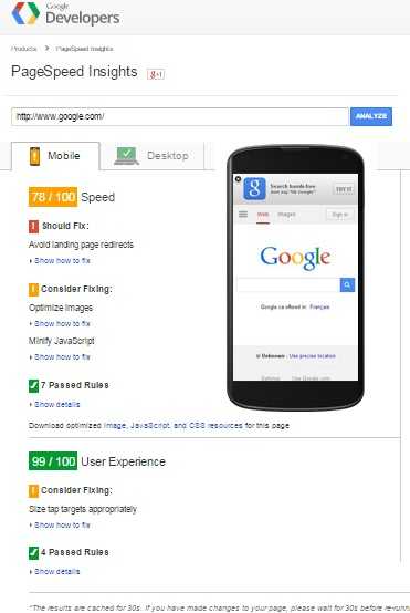
Want to find out more about making your site Mobile-Friendly or to see how Google and the other site engines stack up when it comes to Mobile-Readiness click here:
Labels: google mobile-friendly update, making your site mobile friendly, mobile websites, mobile-friendly
posted by Titus Hoskins @ 5:57 AM